
The map that became a decision engine.
A redesign of Bajaj Finance's Store Locator — reframed from a place-finder nobody used into a surface that helps customers decide whether a trip is worth making, and act on it without leaving the app.
Overview
The brief was one line: "The Store Locator bounces. Redesign it." The numbers backed it up — 510,000 product searches a month routed to the locator, a 67% bounce rate, 24.6% task success, and every completed trip ending in Google Maps, where Bajaj could no longer see what happened.
But fewer than 2% of monthly active users had ever opened it. Before redesigning the interface, the question had to change: is the customer trying to find a location, or to accomplish something through one? The answer turned a marketing asset measured in page views into a commerce asset measured in conversion — with new ownership across five functions and six P&Ls.
Research
Twelve assumptions were written down before any research began. A clickstream audit of 993,000 users, 16 in-depth interviews with live tasks on production, 8 front-line agent interviews and 215 survey responses then tested them — six of them turned out to be inverted.
- Underused, not underperforming — 90% of customers never knew the locator existed. There were no complaints because there was no usage.
- Purpose-driven, not exploratory — 9 in 10 people arrive with one specific job and want it resolved in 30–60 seconds.
- The list decides, not the map — list views converted at 29–43%; the map converted 4–5× worse.
- Store and branch are one journey — customers use the words interchangeably, so the IA shouldn't separate them.
- What people wanted before going — phone number (67.5%), exact distance (65.9%), working hours (62.7%), in-stock confirmation (54.8%) and savings (42.1%).
Four archetypes came out of the synthesis — the Decisive Buyer, the Offer-Led Browser, the Monthly Verifier and the Branch Resolver — each with a different level of urgency and anxiety.
Strategy
The journey was reframed from Discovery (where is it?) to Intent (what's the job?) to Decision (is it worth going?) — and roadmap priority moved from polish to adoption, because a feature nobody knows about can't be made more usable.
- Intent first → ask the job, not the noun; a task-first IA replaced 11 categories that had a 46.4% mapping failure.
- Best path, not nearest place → route people to digital or physical fulfilment, whichever actually resolves the job.
- Never end at an address → every leaf ends in an action: apply, call, book a callback, pay.
- Honest absence → state what we don't know, with "last verified" timestamps instead of faking real-time data.
- Tone matches moment → no promotion on anxious, servicing-led surfaces.
Five cross-functional disagreements — storefront imagery, a central offers database, real-time offers, offer portability and map integration — were each resolved with a shipped compromise and an explicit record of what was given up.
Redesigned states
Instead of auditing 71 screens, the work focused on the six states where a customer decides to continue or leave — each rebuilt to carry product, category and pincode context through the whole journey.
Entry — show what's here before asking anything
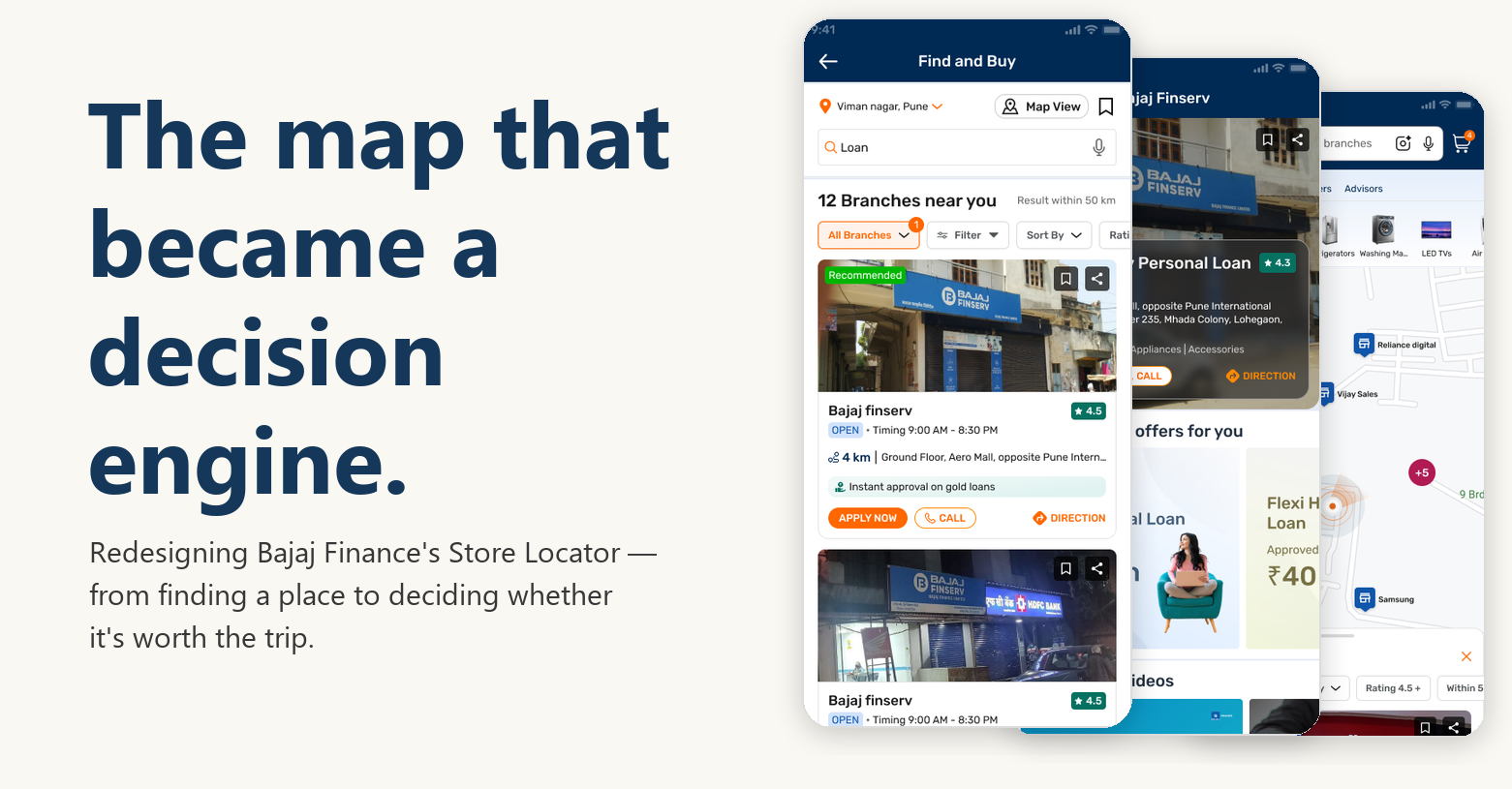
An 11-category pin grid gave no sense of what was nearby. Replaced with named entity tabs, a stated count and radius, an editable location, and the product the customer came from kept in context.
Search — understand the way people actually ask
Search returned silence for anything it didn't match exactly. Added autocomplete from the second character, brand synonyms, pincode and vernacular queries, plus voice and photo input.
Results — list-first, with the answers people need to go
Cards had four equal-weight buttons and none of the information people asked for. Rebuilt list-first with a real storefront photo, rating, hours, distance and a branch-specific offer.
Decision — use what only Bajaj knows
The 20.5% card-tap rate wasn't a design defect — it was an ownership vacuum. The detail view now shows pre-approved limits, eligibility and offers from Bajaj systems, alongside phone, hours and ETA.
Trip — keep the journey inside the app
Every trip used to end with a hand-off to Google Maps. An in-app map with named pins, clustering and Apply / Call / Book callback actions now keeps the journey in Bajaj's app and captures visit outcomes.
Degraded — no dead ends
A denied location permission produced a blocking modal and a disabled button. Now there are three exit paths — allow, enter manually, or skip — and a wider radius when nothing is nearby.
Outcome
Time on task dropped from 87 to 60 seconds, and the effect carried into the businesses: store and dealer visits for B2B Retail EMI rose 25%, and Gold Loan business grew 10%. AI shortened research synthesis, audits and design variant exploration — but every shipped decision was checked against the evidence. The full walkthrough, including before/after screens and the service blueprint, is linked above.