
Building a scalable design system from scratch for 10+ enterprise products.
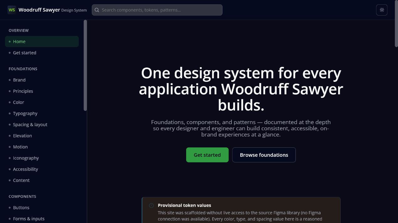
Meridian needed one consistent language across foundations, components, and patterns — extracted directly from Figma tokens and shipped as a living, browsable HTML reference rather than a static style guide.
Overview
Meridian's product surface had grown to span 10+ product areas — dashboards, claims workflows, document handling, communication tools, and more — each built slightly differently, with colours, spacing, and components drifting from the original Figma designs. The goal was a single design system that engineering and design across every one of those products could trust as the source of truth.
Rather than a static PDF or a Figma-only library, I built the system as a browsable, versioned HTML reference — foundations, components, and patterns all rendered live from the same token set the product actually ships with.
Token system
Colours and typography were extracted directly from Figma metadata — hex values read from labelled text nodes on the source Color canvas — rather than eyeballed from screenshots, so the tokens matched design intent exactly.
- Primary brand — Brand Green 01/02 and Brand Dark 01, mapped to buttons, logo, and nav surfaces.
- Neutral scale — an 11-step grey ramp from Black 100 to White, standardised as
--gray-50through--gray-900. - Utility colours — alert, warning, and success states, plus generic tag backgrounds.
- Typography — Open Sans across four weights, with a defined type scale from a 10px micro-label up to a 36px H1.
Where Figma metadata didn't expose an exact hex label — secondary/tertiary and data-display accents — I flagged those swatches explicitly as approximations rather than presenting guesses as ground truth, so engineering knew exactly which values were safe to hard-code.
Structure
The system is organised into five navigation groups spanning 10+ product areas, growing from 20 to 29 pages as gaps were identified against the source Figma file:
- Overview (2) — landing and getting-started guidance.
- Foundations (8) — principles, colour, typography, spacing/layout, elevation, motion, iconography, accessibility.
- Components (11) — buttons, forms, controls & tabs, cards, tables, tags & status, navigation, feedback, overlays, avatars, data modules.
- Patterns (4) — dashboard, form layout, right panels, right rail.
- Common Core (4) — document cards, notes/tasks/email, contact cards, workflow tasks — the shared building blocks specific to the claims domain.
Every new component family shipped with matching CSS classes in a single shared stylesheet — tabs, counters, tags, status pills, content modules, panels, document and contact cards, workflow cards — so engineering could adopt components without re-implementing patterns per page.
Outcome
The result is a design system that reads as one product rather than a patchwork — every component traceable back to the same Figma tokens, and every gap between "what Figma shows" and "what shipped" made visible instead of silently papered over.