
CInsurance brokerage4 min read
Turning a fragmented claims operation into a role-aware, measurable product.
A 6-month strategy-to-delivery redesign of an insurance brokerage's Claims Management System, built for 1,500+ professionals across P&C, Management Liability, and Workers' Compensation.
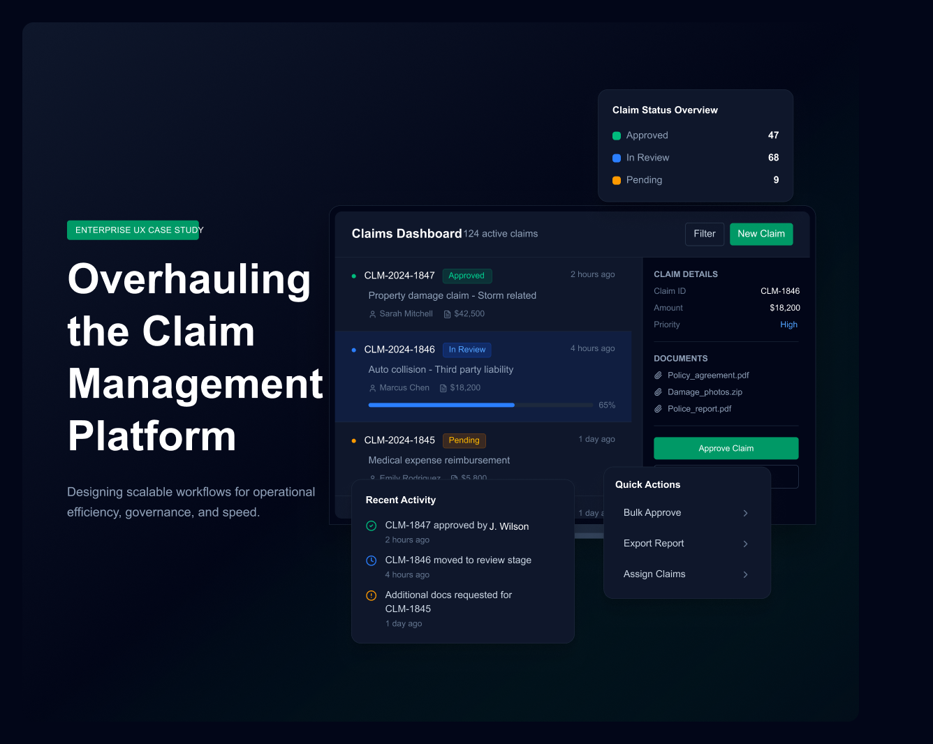
- Role
- Lead Designer & Strategist
- Timeline
- 6 months
- Users
- 1,500+ professionals
- Year
- 2024
Challenge
A claims platform serving 1,500+ professionals was briefed as a UI redesign, while the real failure sat between four roles handing work to each other.
Strategy
I treated it as service architecture — blueprints, actor mapping and backstage workflows — rather than screens, then validated in moderated rounds.
Results
85%+ task success, the journey cut from 14 steps to 8, and contact updates from three days to seconds.
overview
Overview
The Claims Management System was the operational backbone for P&C, Management Liability, and Workers' Compensation claims. The problem wasn't just usability — the business was losing time every day because work was split across the CMS, Outlook, spreadsheets, and manual queues.
My role was to lead the redesign from strategy through research, IA, prototyping, validation, and stakeholder alignment — and to satisfy users, engineering, compliance, and business leadership within a hard 6-month window.
context
Business context & constraints
Before drawing screens, I needed to understand what the organisation was actually trying to recover: time, service quality, compliance confidence, and operational control. This wasn't a UX brief — it was a business emergency in slow motion.
Three constraints shaped every decision: a hard 6-month deadline, existing EPIC and Outlook infrastructure that had to be preserved, and strict regulatory requirements. I treated compliance, timeline, and technical feasibility as design inputs, not blockers — in a constrained enterprise environment, structured design beats blank-slate creativity.
Stakeholder alignment
The project had three different languages in the room: business wanted efficiency, engineering wanted feasibility, and compliance wanted control. I used the strategy brief, heuristic report, personas, IA, and prototype as decision tools — not just deliverables — to turn opinion into evidence-based decisions whenever conflict appeared around scope, integrations, or access control.
There was no designed touchpoint between Claims Handlers and Insurers. Every piece of communication was happening through personal Outlook accounts — nothing in the system, no record kept, nothing that survived when someone left the team.
I submitted it but I don't know if anyone saw it. What happens next?
discover
Discovery & research
Discovery started by mapping users before interviewing them — which roles existed, what they owned, and what daily work actually looked like.
- A user profile matrix proved a one-size-fits-all design would fail.
- Task profiling revealed role-specific needs, like the Shared Email Inbox.
- Task prioritisation decided what deserved first-level navigation.
- Structured interviews converted pain points into seven named design requirements.
In parallel, I ran a heuristic evaluation against the legacy system. Four critical violations became non-negotiable redesign requirements: visibility of system status, recognition over recall, consistency across modules, and user control (no undo or recovery). Both interviews and heuristics converged on the same conclusion — the system was offloading cognitive work onto users.
Personas & scenarios
Two validated personas clarified two operating modes: Jack represented complex review and full claim context; Sammie represented speed, visibility, and handoffs. Scenario-based storytelling — Jack's meeting-prep failure, Sammie's FNOL flow — made the cost of the existing system visceral for stakeholders rather than abstract.
From UX problem to service problem
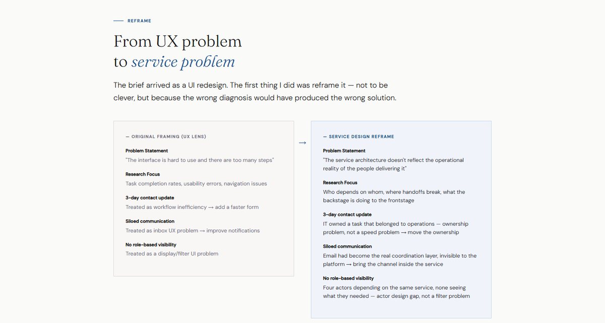
The brief arrived as a UI redesign. Reframing it was not cleverness — the wrong diagnosis would have produced the wrong solution, and the same three symptoms read completely differently through the two lenses:
- A three-day contact update. Through a UX lens, a slow form to speed up. Through a service lens, IT owned a task that belonged to operations — an ownership problem, not a speed problem.
- Siloed communication. Through a UX lens, an inbox problem to fix with notifications. Through a service lens, email had become the real coordination layer, invisible to the platform.
- No role-based visibility. Through a UX lens, a display and filter problem. Through a service lens, four actors depending on one service with none of them seeing what they needed.
Mapping the actors, not just the users
Before designing anything I mapped who actually touched the service and how they depended on each other. The ecosystem exposed four undesigned relationships, one completely missing actor touchpoint — the supervisor had none — and two channels operating entirely outside the service boundary.
ia
Information architecture & design
Card sorting showed users organised their thinking around the claim file, not isolated system modules — so the new IA used role-based entry points, task-first navigation, a central claim file, and secondary admin/reporting flows. IA was the highest-leverage investment in the entire project.
I used SCAMPER to keep ideation structured and accountable to research: substitute flat tables, combine claim file and email, adapt task panels, magnify status visibility, eliminate unnecessary steps, and rearrange navigation around user relevance. The old dashboard — a flat intake table — became a role-aware workspace with Today's Tasks, smart filters, inline status badges, and role-aware claim lists.
Four strategic decisions
- Outlook integration — eliminated constant app switching.
- Automated task creation — replaced manual handoffs between teams.
- Real-time EPIC sync — removed stale-data decision-making.
- Self-service contact directory — retired the Excel spreadsheet and 3-day IT ticket process.
Each was a cross-functional initiative requiring design, engineering, compliance, and business alignment — not just a UI feature. Integration was the user experience; the biggest wins came from eliminating boundaries between systems.
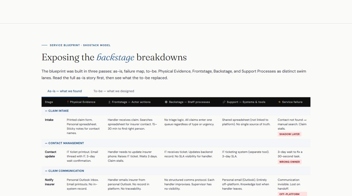
A blueprint in three passes
The service blueprint was built as-is, then as a failure map, then to-be, with Physical Evidence, Frontstage, Backstage and Support Processes as separate lanes. The Physical Evidence row was the most revealing: sticky notes, printed emails and personal spreadsheets are a visible map of every undesigned layer in a service.
The finding that reset the scope: of the fourteen steps in the as-is journey, six existed only as workarounds for backstage failures. They were not process complexity to streamline — they were symptoms to remove, which is how the journey went from fourteen steps to eight.
Designing the fixes, not the screens
Each fix names what changed structurally. Contact management became self-service with a permissions model and an audit trail, removing the IT dependency entirely — three days to thirty seconds. Claim communication came back inside the platform with two-way Outlook sync, so knowledge survives a handoff. The supervisor got a role-based dashboard, the first designed touchpoint that actor ever had, which returned three to five hours a day the team had been losing to interruptions. Handoffs became a structured, notified event, and resolution gained templates and a feedback loop — the first institutional learning the service had.
validate
Validation & change management
The Figma prototype became the living contract between design, engineering, business, and testing — protecting design intent from dilution during implementation. Validation used remote testing with six participants across Consultant, Co-ordinator, and Coverage Manager roles, measuring performance against a seven-task protocol, not just preference.
Round 1 exposed document-classification and status-escalation issues — treated not as failure, but as the mechanism that made the design production-ready before it reached engineering. Testing failure at prototype stage is cheaper than discovery at deployment.
Deployment isn't the end — adoption is. A redesign that 1,500 people don't adopt is still a design failure, so rollout included stakeholder previews, role-specific onboarding, and developer handoff documentation that protected the usability gains earned during testing.
impact
Impact
Every KPI closed the loop back to a research problem. Measurement — efficiency, effectiveness, errors, memorability, satisfaction — was defined before a single screen was drawn.
The claimant at the end of the chain
Internal inefficiency never stays internal. Mapping the claimant journey showed each backstage failure arriving as a frontstage moment of anxiety: silence after submission, a black box during evidence collection, and conflicting information from a call centre reading data a day out of date. The recovery arc in the to-be design is causal, not cosmetic — fix the ownership and the silence stops.