
CCanara Bank2 min read
Redesigning a trusted bank's app for branch-first customers.
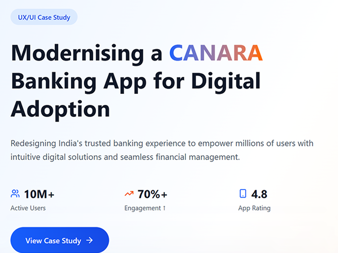
A UX/UI overhaul of Canara Bank's mobile banking experience — rethinking core flows to bring traditional, branch-first customers into everyday digital banking.
- Role
- Product Designer
- Platform scale
- 10M+ active app users (product reach, not a redesign outcome)
- Platform
- Mobile Banking App
- Year
- 2018
Challenge
A bank built on decades of branch-first relationships needed digital journeys its most hesitant customers would actually complete.
Strategy
I redesigned every high-frequency journey — dashboard, login, transfers, UPI, bills — around familiarity and reassurance rather than app convention.
Results
Core journeys reachable in 7 clicks, fewer than the banks it was benchmarked against.
overview
Overview
Canara Bank's mobile app served a customer base built over decades of branch-first, relationship-driven banking. Many of those customers trusted the bank implicitly but had never used a banking app for anything beyond checking a balance — the digital experience needed to earn the same trust the branch already had, not just replicate what a banking app "should" look like. The brief internally was framed as "The Inclusive New" — modern enough to compete, familiar enough not to alienate the customers who trusted the brand precisely because it hadn't changed.
scope
Scope
Rather than a single screen or flow, the redesign covered every high-frequency journey a hesitant, branch-first customer would actually touch in their first weeks on the app:
- Dashboard — the home screen a returning customer sees every time; contrast, hierarchy, and tab structure were tested in multiple variants before selection.
- Login — the very first impression of "is this safe," including launcher icon options and entry flow.
- Fund transfer (MBS) — select beneficiary, add new beneficiary, transaction success and failure states.
- UPI send money — account selection, beneficiary selection, and the transaction flow end to end.
- Bill payment — payment selection through to transaction confirmation.
- Credit card payment — its own dedicated flow, given how differently users approach credit vs. debit transactions.
- UPI PIN setup & pop-ups — the moments most likely to cause drop-off if the interruption feels untrustworthy.
Each flow was designed and reviewed in a medium-contrast variant specifically selected for Canara's brand, alongside alternative contrast and icon treatments considered and rejected along the way.
benchmarking
Competitive benchmarking
Before redesigning any flow, the existing experiences of comparable banking apps were mapped directly — not as inspiration, but as a baseline to beat on a concrete, countable measure: how many taps a customer needs to complete a core transaction.
That gap compounds fast for a customer who isn't confident using the app in the first place — every removed tap is one less place for a hesitant, branch-first user to lose their nerve and abandon the transaction.
outcome
Outcome
The full visual walkthrough — every screen variant, flow, and rejected alternative — lives in the original case study deck, linked above.